Layout
The <Layout> tag is a wrapper that allows you to create custom page layouts using HTML, CSS, and Javascript. You can use the <Layout> tag in your components. When you create a new component, simply add the <layout> tag as the outer wrapper for the component.
Layout Container
The <layout> tag is used to structure the main layout of a page. It serves as the container for elements like headers, footers, and the main content sections.
Properties
The <layout> tag has the following properties.
| Property | Type | Required | Description |
|---|---|---|---|
className | string | Required | A custom CSS class that you can add to styles in the Layout. You can assign any value you want and specify in your stylesheet how you want the layout to look. For example, className="layout-container". |
Container Component
The container component is a reusable container that represents various sections if a page, such as headers, footers, and content areas. It allows you to pass in properties like type, scope, tagName, and className to adjust its behavior and appearance based on the content it wraps.
Properties
The Container component has the following properties.
| Property | Type | Required | Description |
|---|---|---|---|
dataRef | object | Required | A reference to the content data to be rendered inside the container. This property should link the container to the corresponding content object. For example, dataRef={content.header}. |
type | array | Required | An array specifying the type of content the container holds, for example, header, footer, section, or banner. This is useful for styling and dynamically adjusting the layout based on the content type. |
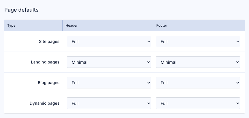
scope | string | Optional | Defines the scope of the container. It is used to indicate whether content is specfic to a page or applies globally, for example scope="global" for site-wide elements like headers or footers. If scope is global then you can set a global layout for different page types in Design > Layouts. If no scope is set then you can apply your layout to a page within the page settings drawer of a specific page. |
tagName | string | Optional | Allows the container to be rendered as a specific HTML tag. This is useful for semantic HTML, ensuring headers render as <header> and footers render as <footer>. |
className | string | Optional | Applies a custom CSS class to style the container. For example, .header-container could style the header container with custom styles defined in your CSS. |
Example
Below is an example of a layout:
<Layout className="layout-container">
  <Container
    dataRef={content.header}
    type={["header", "banner"]}
    scope="global"
    tagName="header"
    className="header-container"
  />
  <Container
    dataRef={content.main}
    type={["section", "banner"]}
  />
  <div class="sticky-bottom-spacer"></div>
  <Container
    dataRef={content.footer}
    type={["footer", "banner"]}
    scope="global"
    tagName="footer"
    className="footer-container"
  />
</Layout>
Using a Layout
Once you've created a layout component, you can apply your layout to a page within the page settings drawer of a specific page.

Or, set a global layout for different page types in Design > Layouts